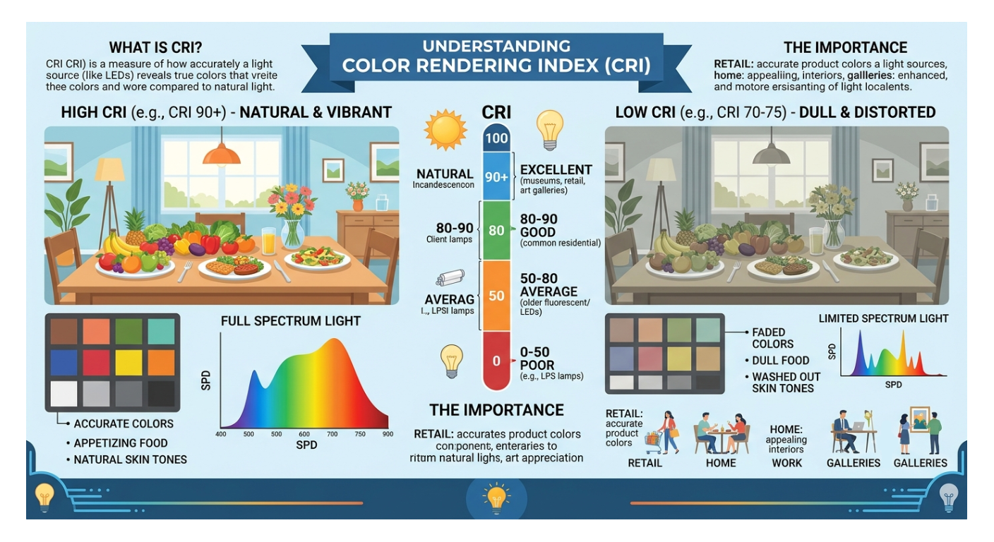
Have you ever purchased a piece of clothing under store lighting, only to walk outside into the natural sunlight and realize the shirt is a completely different shade than you thought? Or perhaps you've noticed that food in a certain restaurant looks dull, while at another, every dish pops with rich, vibrant color.
The secret behind this phenomenon isn't magic—it’s CRI.
In the era of energy-efficient LED lighting, understanding CRI (Color Rendering Index) has become essential for creating spaces that feel comfortable, vibrant, and true to life. Let’s break down what CRI is, how it works, and why it should matter to you.
What is CRI?
CRI (Color Rendering Index) is a quantitative measure on a scale from 0 to 100 that describes how accurately a light source reveals the true colors of objects compared to a natural light reference source (like daylight or an incandescent bulb).
- 100 CRI: The gold standard. Colors look exactly as they would under natural sunlight.
- Low CRI (below 80): Colors appear washed out, dull, or distorted, making it difficult to distinguish subtle shades.
How Does CRI Work?
To determine a light bulb's CRI score, testing organizations evaluate how the light source illuminates a standardized set of color samples (historically 8 pastel colors, designated R1 through R8, though modern metrics often look deeper, including the critical R9 value for saturated reds).
The closer the colors under the test light match their appearance under natural sunlight, the higher the CRI score.
- 90 to 100 (Excellent): Ideal for places where color accuracy is paramount—art studios, retail fashion, high-end kitchens, and photography setups.
- 80 to 89 (Good): The baseline standard for most residential and general office lighting. Adequate for everyday tasks, though certain deep reds and skin tones may look slightly muted.
Below 80 (Poor): Often found in cheap or older fluorescent and LED bulbs. Colors look flat, grayish, or artificially green/yellow.
While lumens measure how bright a light bulb is, CRI measures how good that light is. Here is why upgrading your living or working space to high-CRI lighting makes a massive difference:
- Food Looks Fresher and More Appetizing: In a kitchen or dining room, low-CRI lighting can make fresh produce and meats look gray or unappetizing. High-CRI lighting brings out the rich reds, deep greens, and vibrant yellows of your meals.
- Skin Tones Look Natural: Low-CRI lights can give people a sickly, jaundiced, or washed-out appearance. High-CRI bulbs make skin tones look warm, healthy, and natural.
- Accurate Interior Design and Decor: Paint colors, fabrics, and wood finishes react heavily to lighting. If you’ve spent weeks choosing the perfect wall paint, a low-CRI bulb can completely ruin the intended aesthetic.
The Modern LED Revolution
- In the early days of residential LEDs, many bulbs sacrificed color accuracy for energy efficiency, leading to a reputation for harsh, clinical, or greenish lighting.
- Fortunately, lighting technology has evolved dramatically. Today, premium LED manufacturers routinely offer CRI 90+ (and even specialized TM-30 metrics) without sacrificing energy savings. When shopping for replacement bulbs, checking the packaging or specification sheet for a CRI rating of 90 or higher is one of the easiest ways to instantly upgrade the ambiance of your home.
- Choosing the right lighting for your home comes down to balancing two distinct metrics: Kelvin (K), which sets the mood and warmth of the light, and CRI, which ensures visual clarity and true-to-life colors.
- To get the best results, it helps to think of Kelvin and CRI as a team—one creates the atmosphere, while the other makes sure your space looks vibrant and accurate within that atmosphere.
Quick Refresher: Kelvin vs. CRI
- Color Temperature (Kelvin): Measures how warm (yellow/amber) or cool (blue/white) the light appears.
- 2700K – 3000K: Warm, cozy, and inviting (similar to traditional incandescent bulbs).
- 3500K – 4000K: Neutral, crisp, and clean (ideal for focus and task work).
- 5000K+: Cool, energizing daylight (best for high-detail visibility).
CRI (0–100): Measures color accuracy. Aim for 80+ as a baseline for general spaces, and 90+ (with a strong R9 value for reds) in rooms where color, skin tones, and food matter.
Room-by-Room Lighting Guide
1. Kitchen
- Recommended Kelvin: 3000K – 4000K
- Recommended CRI: 90+
- Why it works: The kitchen is a high-function workspace where you are chopping ingredients, reading recipes, and checking if food is properly cooked. A neutral white (3500K–4000K) keeps the space bright and alert, while a CRI of 90+ is crucial so fresh produce, meats, and finishes look appetizing and true to color rather than dull or grayish. (Tip: If your kitchen opens directly into a cozy living area, stick closer to 3000K so the two spaces blend seamlessly).
2. Bedroom
- Recommended Kelvin: 2700K (or 2200K–2700K for bedside lamps)
- Recommended CRI: 85 – 90+
- Why it works: Your bedroom is a wind-down zone. Warm 2700K lighting minimizes blue light exposure, signaling to your brain that it is time to relax and prepare for sleep. If you have a walk-in closet or dressing area attached to the bedroom, bump the CRI up to 90+ (and consider 3000K–3500K there) so you can accurately tell navy blue from black when picking out outfits.
3. Home Office / Study
- Recommended Kelvin: 4000K – 5000K
- Recommended CRI: 90+
- Why it works: Cooler, daylight-balanced light mimics natural afternoon sun, helping suppress melatonin to keep you focused, alert, and productive. Pair this with a CRI of 90+ to reduce eye strain when reading physical documents and to ensure you look natural and healthy on video calls. (Tip: If you work late at night, consider tunable white bulbs so you can shift down to 3000K after sunset).
4. Living Room
- Recommended Kelvin: 2700K – 3000K
- Recommended CRI: 90+
- Why it works: Living rooms are meant for relaxing and entertaining. Warm white light creates an inviting atmosphere, while a high CRI brings out the rich textures in your furniture, wood flooring, rugs, and wall art, while making guests' skin tones look warm and natural.
5. Bathroom & Vanity
- Recommended Kelvin: 3000K – 3500K
Recommended CRI: 90+ (High R9)
Why it works: Bathrooms require a balance between flattering warmth and crisp visibility. Around 3000K–3500K avoids the harsh, sterile look of hospital lighting while still being bright enough for grooming. A 90+ CRI is non-negotiable at the vanity mirror—it ensures accurate makeup application and gives a healthy, natural reflection of skin tones.
Pro-Tips for Buying & Layering
- Check the "Lighting Facts" Label: On bulb packaging or spec sheets, look for the exact Kelvin number rather than vague marketing terms like "Soft White" or "Daylight," as these can vary slightly by brand.
- Don't Mix Temperatures in the Same Zone: Avoid putting a 2700K bulb and a 4000K bulb in the same room or multi-bulb fixture—the clash between yellow and blue light will make the room feel disjointed.
- Use Dimmers or Tunable Bulbs: In multi-purpose spaces (like a kitchen island that doubles as a homework station and an evening entertaining spot), installing dimmers or smart tunable bulbs lets you adjust the mood throughout the day.